Posts By alison
Movin’ On Up!
That’s right, Bit of Butter is moving! Â Let’s ignore the fact that this means we have to move our house, Etsy items, and assorted detritus in the next few weeks and focus on the positive, shall we? Â We weren’t planning to move, but our real estate agent (who is amazing and wonderful) emailed us a house (just a mile away from our current abode). Â The next day I went to visit and the day after that, we put in a low-ball offer…that was accepted!
The new house has a lot going for it, even though it needs a lot of work. Â Mostly, it has a lot of space for our family, the shop, and for friends to come over and share a glass of wine with us. Â Plus, it has the most amazing chandelier we’ve ever encountered by Mazzega, made out of interlocking pieces of Murano glass.
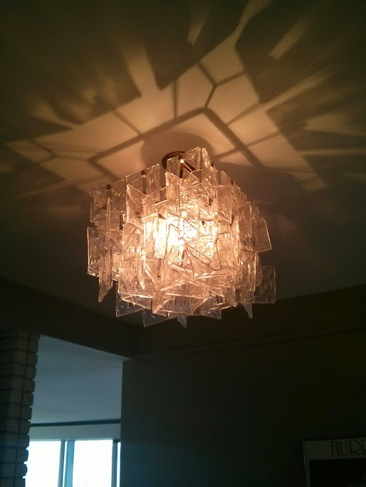
How could we not buy this house when this beautiful testament to mid-century design is in the entryway? Â So stay tuned for more posts about the new house as we begin to decorate, renovate, and explore!
A Rare Thing
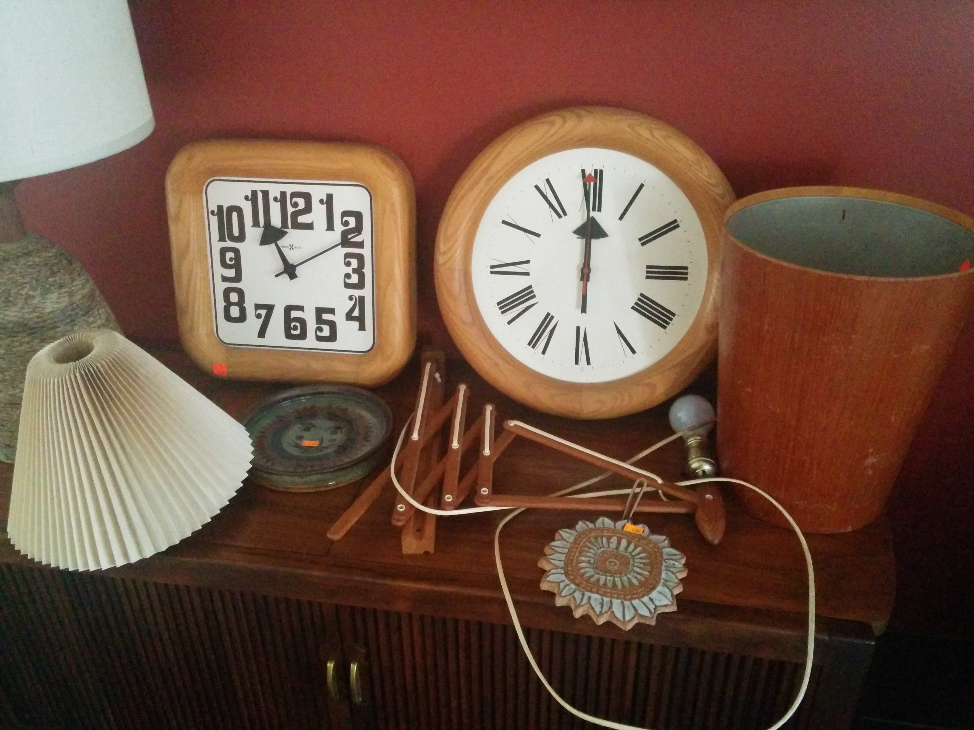
Last weekend we hit up a wonderful estate sale. Â K. left early (or late, depending on your perspective) and Miss S and I took the bus up to meet him. Â We got some amazing items for the shop! Â First off, a few Howard Miller clocks with arms designed by George Nelson and body designed by Arthur Umanoff (what a wonderful combination) and a vintage Le Klint “Sax” lamp with original, hand-folded shade. Â Other finds include a Jorge Wilmot plate or ashtray, Swedish teak trashcan, and Victoria Littlejohn wall tile.
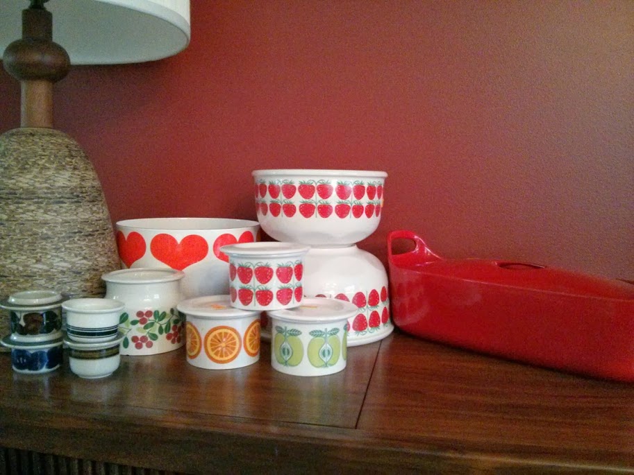
Next up, lots of colors! Â On the left, we have a Timo Sarpaneva for Rosenlew enameled casserole and a bunch of amazing Arabia (oh, and the Finel heart bowl)! Â You guys, it was so so very exciting to be at this sale. Â It’s been a very long while since we’ve had this much great stuff for the shop!
Thrift Roundup: 12.2.13
Last week was Thanksgiving here in the states. Â The day after Thanksgiving is Black Friday, the most horrible shopping day of the year–a day we usually don’t bother to go thrifting because of the crazy crowds. Â This year, we tried it anyway and there were definitely good deals to be had. Â Our local Goodwills were offering 50% off. Â We went to just one at around noon and the line reached to the back of the store. Â Value Village / Savers on the other hand, were lovely. They were offering a 30% deal with your membership card, but all the Savers we went to were practically empty. Â We went thrifting throughout the long weekend and found some great stuff for the shop!
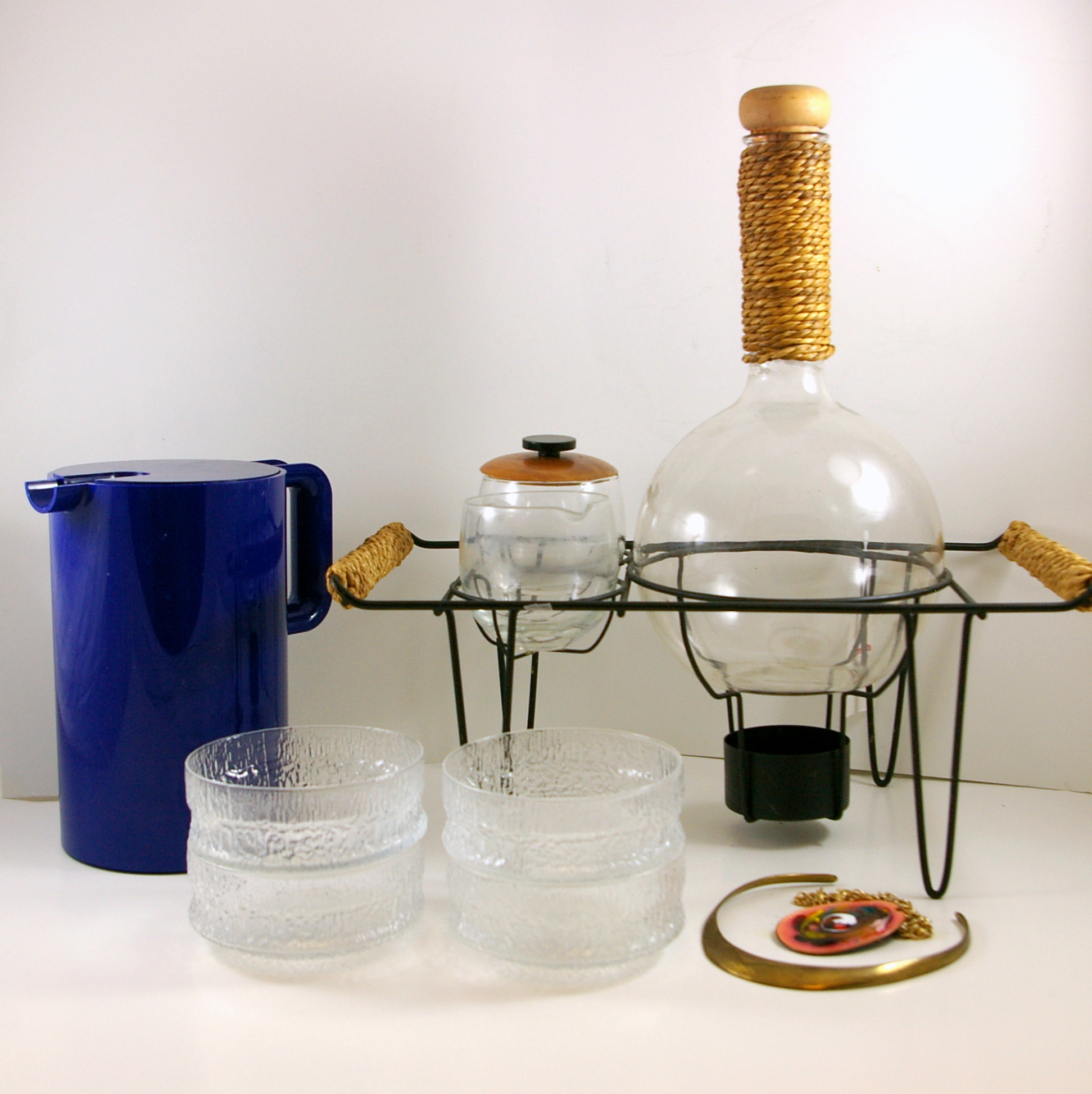
First up is a Ben Seibel coffee set for Tempron Taste Tempters for Gilley with original sea-grass handles, a Heller pitcher, some vintage jewelry, and a set of Padaar bowls from Iittala. Â We were very surprised by the bowls — they’re a lot lighter in feel than Ultima Thule.
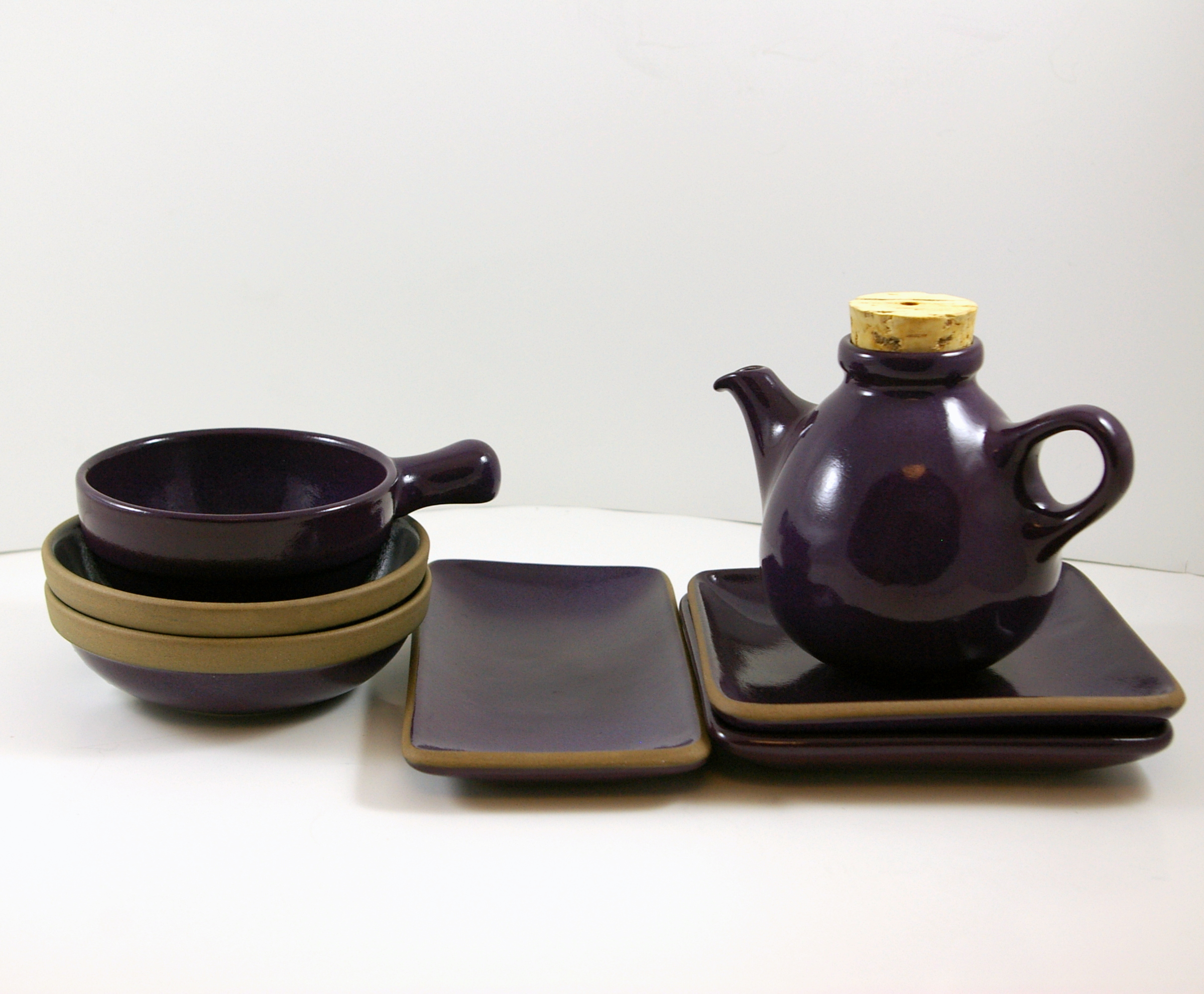
Next up is a small collection of Heath in a shiny, purple glaze. Â We’re not sure when these were produced, but we’re guessing sometime in the 1990s?
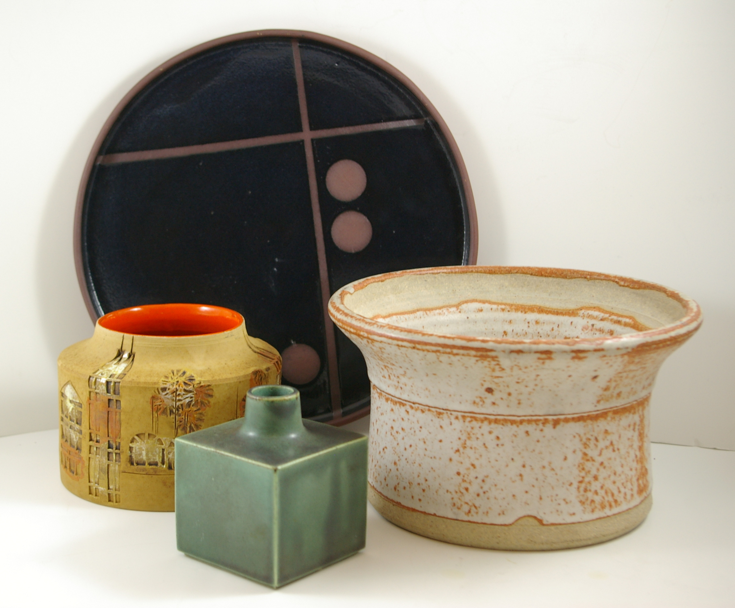
Finally, we found a big group of ceramic pieces this weekend. Â The small vase in the front is a Japanese import, likely from the 1970s. Â The shino-glazed bowl is a studio piece from Pacific Northwest potter, Jim McBride. Â The plate in the back is also by a Seattle area ceramicist, Ben Bieri (thank you, A La Modern for your help with the ID). Â Finally, the beautiful vase on the left is by Bitossi. Â Sadly, there’s some damage on the foot of this piece, but we just couldn’t leave it behing — I mean, just look at it!
The Taste Setters
We’ve recently started a new endeavor with a small group of friends. It’s called Taste Setters! Every week we have a themed flash sale of exclusive vintage items. Stop on by!
Thrift Roundup: 10.14.13
As per usual, we never have time to update with thrifting posts. Â All of our friends (yes, A La Modern and Mid Mod Mom, we’re looking at you) are much better at it than we are. Â Maybe it will be our Halloween resolution to be better at weekly posts? Â Why not!
 We didn’t find many smalls this weekend, but the ones we ended up taking home are great. Â Two pieces of Blenko made the cut: one is a large #39 “Pinched Ivy Vase.” Â This vase is 8 inches tall. Â Don’t ask us about the color: aqua? surf green? it’s so hard to tell! Â We also picked up a #533 vase. Â This model seems to follow us around, but we’ve never found one of the big versions before so we were excited.
The white tea pot is from Krups’ Guggenheim collection and is part of their Frank Lloyd Wright line. Â Not something we’d usually pick up since they were produced in the 1990s, but it’s got great lines and will soon find a home with some lucky collector. Â Finally, we found an Austrian ashtray made by Richard Rohac. Â People often misattribute this piece to Rena Rosenthal because of the “RR” stamp, but Modern Vienna Bronze sets the record straight that “RR” was Richard Rohac’s stamp after he left Hagenauer in the early 1950s.
 We also found a pair of Laurel lamps in amazing condition. Â Yes, those are the original shades (also marked Laurel), but we’ll probably sell them without the shades, which are a little dog-eared, to say the least.
 Finally, we actually found some art worth mentioning. Â The piece on the far left is by David Lance Goines. Â It’s a limited edition lithograph from 1977 and has some lovely gold details. Â The four prints in the middle are also lithographs from the Science Exhibition of the Seattle World’s Fair. Â They came from a collection of 20 plates available for purchase at the Fair that demonstrate the future of scientific endeavors. Â Finally, the two woodblocks are by Shodo Kawarazaki, a Japanese artist famous for his botanical prints.
As per usual, ping us if you’re interested in any of our latest finds!
Thrift Roundup: 9.15.13
You guys, we’ve been so bad about posting our weekly thrift finds and even worse about linking up to other blogs with our finds. Â We’re lucky if we get a blurry group shot up to the #thriftbreak twitter folks before we unceremoniously begin prepping items for the shop. Â I’ve been promising myself that *this week* will be different, but it never is. Â Much like A La Modern, we’ve been tired, run-down, and a little meh about thrifting lately.
Yesterday we finally had a day that deserves a post! Â We hit up a local rummage sale that we’ve been going to for the past few years. Â After slim pickings last year and the year before, we finally picked some great stuff! Â Herewith the blurry cell phone pic taken just after we got home.
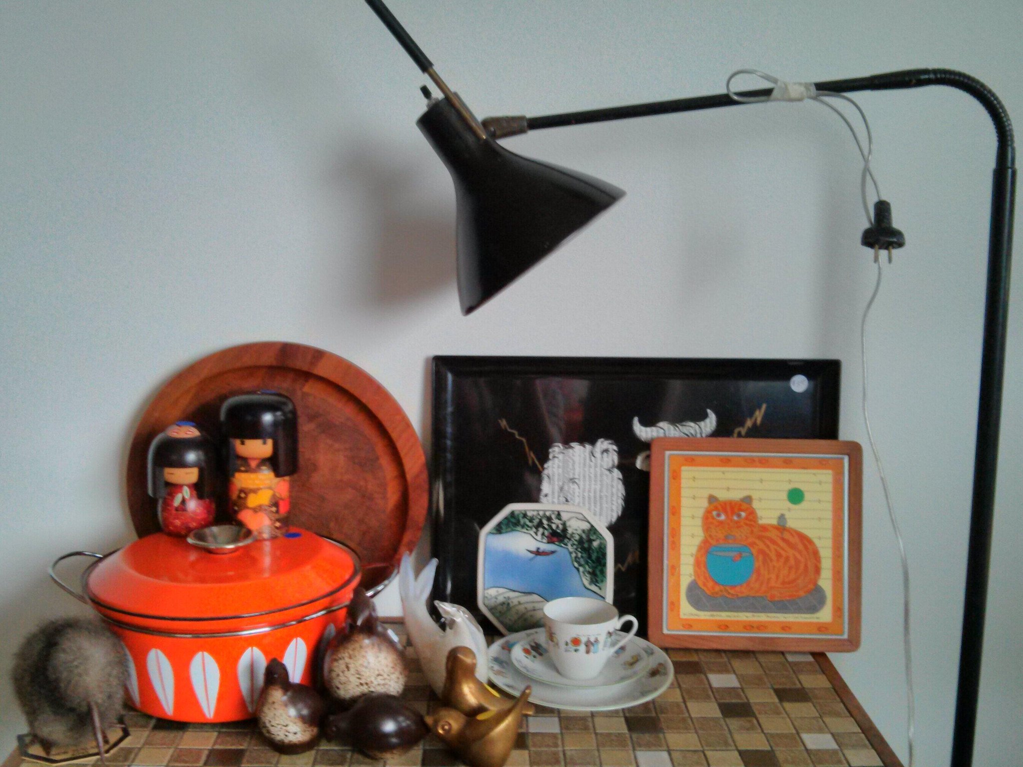
Yeah, we were amazed too. Â Usually we’ll find some broken Nymolle and maybe a few stained Vera tea towels at local rummage sales, but not yesterday! Â The best score is probably the Kurt Versen lamp, probably made in the early 1950s. Â We’re surprised his lamps aren’t more well-known in the typical mid-century circles. Â We were happy to pick this piece up!

Someone got rid of their collection of Howard Pierce birds (even two gold-plated ones, which we’ve never seen in the wild before). Â Truth be told, even though we’re on the west coast, we don’t find a lot of Howard Pierce here — so we were really excited to snag these birdies.

We also found this beautiful, glass bird. Â Thanks to Temple of Vintage, we think this might be Murano, but we’ll have to do a little more research to figure out a possible maker for the piece. Â The forked tail is especially interesting, since not many of the other Murano birds we’ve seen have such a lovely tail.
Go checkout more thrifting finds over at Sir Thrifts A Lot!
Our latest obsession: Vintage ikebana
We’ve come across a number of vintage ikebana vases recently, much to our surprise. Â We love the way ikebana experiments with form, style, and function. Â All of these pieces will soon be available in the shop! Â Even though they’re gorgeous, we can’t keep all of them in our collection.


Spotting the Fakes: It’s Not a Curtis Jere Lion
Thanks to Chelsea over at Bergen House for giving us the idea for this post! Â Every so often someone will thrift a a metal lion…a really cool looking metal lion. Â And, like all of us, s/he searches for this metal lion on Google and finds sellers at First Dibs and other reselling sites calling it a Curtis Jere lion. Â What luck! Â Sadly, Curtis Jere never produced a metal lion figurine, even though many online sellers are claiming they did.

- Image from Hidden Treasures for You
Hidden Treasures for You is an online storefront that sells discontinued items from Pier One Imports and they are selling this brutalist lion statue that is most definitely NOT Curtis Jere. Â In fact, the earliest sale record I can find for the lion is in 2008, so I’m going to go out on a limb and suggest that the lion was probably gracing the shelves of Pier One around then. Â So please, don’t spend over $100 on a Made-in-China metal lion.
Spotting the Fakes: It’s Not Lisa Larson (or Stig Lindberg)
With the resurgence of Scandinavian Modern design’s popularity comes irresponsible and disingenuous folks who are selling fakes, knock-offs, and similar items as the real deal. Â We’ve wanted to write this post for a long time, but we’ve always stopped short. Â It’s not our job to be the vintage police, but it’s really starting to bug us…so here we go.
We’ve noticed many, MANY sellers trying to pass off 1970s Japanese stoneware as Lisa Larson and Stig Lindberg. Â Not only is this really not cool, but it does a disservice to both Scandinavian and Japanese designs and designers. Â At first, we were going to post a how-to guide to distinguishing real v. fake, but honestly it’s very easy to tell, with only a tiny bit of research, which is which.
The ‘boy on the horse’ is the most egregious misattribution we’ve found. Â It’s gotten so bad that MANY sellers are selling this piece as Lisa Larson and it’s just not her work. Â It’s nowhere in the Lisa Larson books (we have them…it’s not there), plus there are examples of the same piece with its original UCTCI sticker (which is a Japanese import company).
")
From Travelgal07's eBay Store
We’ll revisit this issue in more detail later — once you’ve seen Lisa Larson’s work for Gustavsberg in person, it’s easy to tell the difference between Japanese stoneware and the real thing!
Thrift Roundup: 6.30.13
I forgot to post a roundup this week even though I promised myself that I’d get to it — oops! Â We had some good finds last week and I wanted to make sure that I documented them.

We don’t usually focus too much on art during our thriftbreaks. Â It’s usually overpriced and picked over at our thrifts. Â Last week, however, we found a few pieces of note. Â The works on the left are by Robert Sargent Austin (1895-1973), an English artist. Â We found two etchings of his from the 1930s that are amazingly detailed. Â They need new mattes, but they’re in great condition!

The second piece is a 1970’s woodblock print by a Mexican artist. Â So far, we haven’t figured out an attribution, so please let us know if you are familiar with the artist or work!
Other finds include a wooden kangaroo designed by J. V. Orel (of Zoo-line fame), a Holmegaard “Palet” olive oil cruet designed by Michael Bang, Iron Mountain Stoneware mugs, a Marshall Studios coffee table and vase, and some other odds-and-ends. Â As always, many of the finds will be available in the Etsy shop soon!
