Iittala’s Kekkerit: Spotting the Fakes
We have a long history with Iittala’s “Kekkerit” pattern, which was designed by Timo Sarpaneva for Iittala. Â A source from the 1970s calls Kekkerit (which, incidentally, means party in Finnish) “a robust, happy goblet,” and we couldn’t agree more. Â Other than Iittala’s Festivo candle holders, Kekkerit goblets are one of Iittala’s most copied patterns.
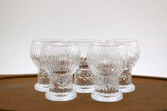
Above, are Iittala’s Kekkerit cordial glasses, which share the same form as the water goblets, but in miniature. Â These glasses are hefty and yet elegant, with the bowl of each goblet shaped like a snowball. Â Like all Iittala glassware, the original Kekkerit’s are incredibly detailed. Â When you hold one in your hand, you can feel each individual facet in the glass.
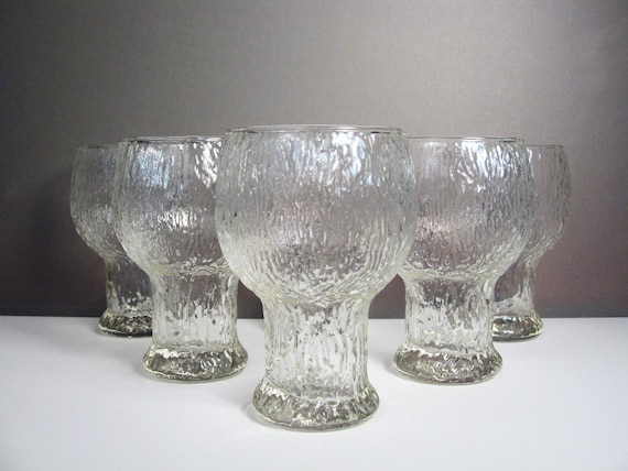
Until very recently, we used imitation Kekkerit goblets for our everyday water glasses. Â Our friend Valentina, who runs the Etsy shop Object of Beauty is currently selling the same glasses and has graciously let us borrow some of her images for this post. Â The Kekkerit-inspired glasses (featured in the above image) are very well made, but the pattern has some key differences from Iittala’s Kekkerit, which are important to note if you’re trying to tell the difference between the two. Â The glasses above do not have a rough, or faceted, finish at all, but instead have smooth-ish ripples.

A key difference between the two goblets is in the shape of the foot. Â Iittala’s pattern has a square foot, which is a little unexpected for glass with such undulating lines. Â The kekkerit-inspired glasses have a much rounder foot. Â There’s also a difference between the bottom of each glass: Iittala’s Kekkerit has a patterned bottom, in keeping with the textured design on the body of the glass, while the imitation goblets have a smooth bottom.
 The biggest difference between the two goblets is that the real Kekkerit’s have a solid foot, which is easily seen when you pour dark liquid into the glass. Â This makes the real thing incredibly heavy, which is great but some people might not like it for everyday use. Â (This is one of the main reasons we used the Kekkerit-inspired goblets as our daily glasses for so long–they were light to the touch and very sturdy.) Â And no, Iittala did not make Kekkerit in an amber color (at least, none that we’ve ever seen)!
Iittala’s Aslak: Spotting the Fakes
Welcome to a new series on the blog: how to spot a fake. Â Why is this important, you ask? Â We’ve seen many an inexperienced seller mistakenly sell knock-off goods as the real thing. Â We have quite a few posts planned for this series, including one on Lisa Larson figurines, and a few more on Iittala glassware.
First up? Â We’re examining Tapio Wirkkala’s “Aslak” pattern for Iittala, designed around 1965. Aslak first appeared in Iittala’s product catalogue in 1973 (Vigier and Pina 155). Â We haven’t seen many knock-offs of these glasses, but we managed to snag one at a thrift a few months back so we could compare the real with the fake, side-by-side.

So, which one wasn’t produced by Iittala? Â The glass on the right. Â The first difference between the glasses is purely tactile — the knock-off glass feel softer to the touch. Â The real Aslak has sharper and more defined edges, especially on the lower half of the glass. Â The definition and texture that is so distinctive in much of Iittala’s glassware isn’t present in the knock-off. Â The upper portion of the knock-off is also less detailed than the genuine article.
 Aslak’s pattern is very vertical. Â If you look closely at the middle portion of the knock-off, the pattern is muddied and no longer runs up-to-down. Â In fact, it looks almost horizontal at times.
 Looking at the glasses from the bottom, the real Aslak has a much thicker wall than the knock-off. Â We thought the top lip of the glasses might be a telling sign between the two as well, as the real Aslak has a very thin lip-line, but we examined the rest of our Aslak and the lip size seems to vary from glass-to-glass (it probably changes depending on the time of production).
 The final difference between the knock-off and real Aslak is the level of detail in the facets at the base of the glass. Â The bottom edge of the the reproduction has far fewer facets, and indeed feels almost smooth to the touch in comparison with the Iittala glass, which feels ribbed and more organic.
Next up — we’ll be looking at Iittala Kekkerit.
Thrift Roundup: 11.4.12

Hi everybody — we’re back with another thrift roundup! It’s been a fairly quiet week at the Butter’s, but we did manage to get out and do some exploring (and thrifting!) The photo above features an interesting find — a vintage souvenir from the Louvre! This is a replica of the blue Egyptian faience hippopotamus figurine in the Louvre’s collection. Apparently, museums around the world sold replicas of their Egyptian hippo statuettes — the Metropolitan Museum of Art’s example, affectionately known as William, is one of the more well-known. We’ll get back to William in a bit. This is our second blue hippo museum souvenir — the first is a replica of a hippo in the collection at the St. Louis Art Museum.

This weekend, we managed to get away for our first day trip with the Butterbean — it ended up being a good trip, although the thrifting was somewhat bare. Mr. Butter found a vintage men’s Pendleton sweater (not pictured), and we found a couple fun kids books, including “A Tale of Two Williams,” featuring–you guessed it–our favorite blue hippo! 🙂
Our other thrift finds this week included — a pair of vintage NOS Dansk salad servers, a set of Ultima Thule Highballs, a nice blue Dala horse, and various and sundry Scandinavian Christmas items. Many of these will be in the shop this week! As always, contact us if there’s anything in particular you’re interested in or that you’re looking for.
Small Victories
Even though we haven’t been posting, we’ve been thrifting. Â It’s hard to maintain our thrifting habit, the Etsy shop, and the blog with a newborn, so even though we have big plans for blog posts, inevitably we’re too tired at the end of the day for much of anything. Â You guys, we go to bed at 10pm now! Â We’re old. Â Sigh.
Since Miss S was a month old, we’ve been taking her to the occasional thrift. Â We strap her into her Beco carrier and off we go down the aisles! Â Sure, the little old ladies give us the side-eye because she’s so young, but I think parents of my generation are learning that it’s important to maintain some semblance of normalcy amidst the storm. Â It’s been good for me to get out-and-about. Â Mr. Butter still goes to the occasional estate sale, but Miss S can’t sit in the car and wait around, so I have to stay home and miss all the fun.
Today, Miss S and I visited two thrifts. Â Even though there was a major diaper blow-out at the first (oh you guys…it was not pretty), we managed to dip ourselves in hand sanitizer and move on. Â  We don’t usually find a lot since we can only go to a few stores, but today we found some cute items for the shop. Â The first is a Figgjo Flint wall plaque or trivet. Â I love Figgjo’s happy designs and this one is sure to strike someone’s fancy! Â We also picked up a Harvey’s Lake Tahoe bucket mug and inside the mug are two kokeshi perfume bottles. Â The faces on the bottles are hand-painted, so each is a little different. Â Given my kokeshi obsession, I couldn’t resist them! Â Finally, we found an articulated brass candle holder. Â I absolutely love these, especially for a holiday centerpiece. Â Everything will be in the shop early next week, so let me know if you want me to reserve something for you!
Thrift round-up, 8/18/2012
It’s been a busy week at the Butters! Our most significant acquisition this week was our new daughter! Miss S was born at the Swedish Medical Center here in Seattle on August 12th! Mother and daughter are both doing well.

It’s been a week now since Miss S decided it was time to arrive, and it’s been a pretty crazy week! I (Mr. Butter) found some time to escape to a local estate sale while Ms Butter stayed home with the Butterbean. I found a few fun things for the shop, and one or two things for the Bit of Butter collection.

This estate sale was in one of the more wealthy neighborhoods in Seattle, and took place in a fabulous MCM home overlooking Lake Washington. The family had tastes very similar to Ms Butter and myself, and the sale was full of wonderful housewares, art, and furniture. First, I was drawn to the teak Dansk tray — this is an earlier design by Jens Harald Quistgaard, and is in great condition. In the kitchen, I immediately snagged a large cache of Michael Lax for Copco — the kettle, baker, ramekins, and gratin dishes are great. Cooking with Lax’s Copco designs is a joy — the cast iron holds the heat so well — we love the bakers in particular. In the kitchen I also found the three Arne Jacobsen ashtrays for Stelton — these are part of the Cylinda line from 1967. The Dansk Kobenstyle gravy and saucier are extremely functional and fun to look at. These are from the later French production, and are much better made than earlier entries that tended to chip and flake extremely easily.
The glass vase and hippo are mysteries — we thought the vase might be Blenko’s #39 pinch vase, but the mouth is different. If anyone knows anything, we’d love your insight.
I almost didn’t notice the vase in the back when I was at the sale, but am I glad I flipped it over! It’s Stig Lindberg for Gustavsberg — I think this is part of his Karneval line — it’s a massive 16″ tall. It’s got a couple of small chips at the bottom, unfortunately, but there was no way I was going to leave it behind.
Finally — the reason I went to this sale is this beautiful oak rocker designed by Hans Wegner for Mikael Laursen in 1940. This seems to be a fairly rare Wegner design, and we’re happy to add it to our growing collection of Wegner furniture. We’ll be doing a blog post soon about the different rockers he designed!

Thrift Round Up: 7.15.12
Our lives are about to change here at Chez Butter. Â Our baby is due on August 20th, so every time we head out on our day-long weekend adventures we’re all to aware that this might be our last #thriftbreak for the next few months or so. Â I feel like the thrifting gods were with us on Friday and Saturday though. Â Here’s a photo of the highlights from our trip(s).

Kevin went out to a few thrifts on Friday night while I relaxed a little and came back with the beautiful Holmegaard “Kluk Kluk” and and the two Finel sauce pots. Â I had visited these stores the day before and found nothing — so it just goes to show that things really do change every day.
On Saturday morning I wasn’t feeling up to thrifting so Kevin headed out again without me and found the Blenko salad set and Marshall Studios jug. Â An awesome package arrived from Sweden while Kevin was thrifting and I opened it to see two Lisa Larson books I had ordered a month back! Â I immediately started flipping through and noticed an image of a little girl named Eva that looked hauntingly familiar.
I called Kevin, realizing that we had seen her a few weeks back during one of our out-of-town excursions. Â We quickly decided that we couldn’t leave poor Eva behind, even though it would mean an hour drive so he picked me up and off we went. Â Thankfully, she was still there waiting for us! Â We also found some other great items for the shop, including a Blenko pitcher, Danish candle holders, and other sundries. Â We also found the giant snowball candle holders — these are much larger than the usual size and weight almost 4lbs. each!
Hopefully we’ll still have the courage to take these spontaneous trips once we have a little one in tow — some of our favorite moments in recent memory have been heading out for parts unknown and thrifting along the way!
Thrift Round Up: 6.30.12
Today’s bout of thrifting was extremely anti-climactic. Â The thrifts were picked over; half of our finds came from a few random estate sales we happened across while driving to the next thrift. Â We can’t complain too loudly because we ended our trip with a Molly Moon’s ice-cream cone and met up with a friend who gave us homemade lemon curd and some locally-produced Shipwreck Honey. Â Behold! Â Our meager thrifting haul:
 We found the vintage Le Creuset #24 frying pan and the Pendleton blanket at the same thrift. Â (As it turned out, it was the only thrift to yield anything of note. Â While Le Creuset used to be much more common in thrift shops, we haven’t seen one in ages, especially not the nice ones with the the original teak handles. Â It should be up in the shop later in the week, if anyone is interested. Â This one is in blue (our favorite of Le Creuset’s colors) and is in superb condition. Â We’re saving our pile of Pendleton blankets for the autumn when we’ll list them in the store, so it’s going into storage until the weather cools off and people are thinking about wool blankets again!
We snagged the last two pieces at estate sales that happened to be blocks away from each other. Â The first is a ceramic vase marked “Ester Israel” on the bottom. Â We’ve seen this name attached to Lapid pieces (for example, this pot with a similar glaze). Â We’re pretty sure this piece was produced during Ester’s tenure at Lapid and it’s a gorgeous example of her work for the studio. Â (It’s currently for sale in the shop!)
Our last piece is a funky, cased-glass martini pitcher. Â We have no idea who the maker of this piece is, but it’s a great piece of mid-century glass and we’re happy to add it to the shop’s inventory! Â The orange seems perfect for summer, don’t you agree? Â Thanks to our dear friend, Sputnik Moss, who found this listing, which shows a similar pitcher with its original Holt Howard sticker! Â So, all signs point that our martini pitcher was likely produced in Japan, probably in the 1960s-1970s. Â Yay!
The Little Things…
We find ourselves much less motivated to post when we aren’t finding glorious mid century treasures, which is why we’ve gone for weeks without updating our poor blog.  We’re much more active on our Facebook page, where we post the new items we’re listing in the shop, and on Twitter, where we’re very active in the #thriftbreak community.  So we wanted to post today about an item that we know next to nothing about.
 We liked the look of this piece — a candle holder in the figure of a woman, so we decided to bring it home from the thrift on the off-chance we can find out a little information about it.  The piece is made from cast metal (iron?) and really, really heavy.  There’s definitely some age to it, so we’re relatively certain that it’s not a recently-made piece.  It also has an intriguing set of initials on the bottom left part of the lady’s skirt.
 THR? Â Perhaps it’s not Roman script all, but a Japanese character? Â So, what’s your guess? Â Is our humble little candle holder vintage? Â Where was she made? Â What’s your best guess?

A Much-Belated Update
You’ve probably noticed we’ve been very quiet lately. Â Even our Etsy shop was quiet for a month or two. Â Well, we had a good excuse: we’re expecting a girl in mid-August and we’ve been busy! Â Now that I’m feeling better, I’ve started posting new items to Etsy and we’re back to heading out to thrifts and estate sales (and I keep a variety of snack foods at the ready).
During the winter months, the thrifts were dead in Seattle. Â We would head out for our normal Saturday jaunt and come home empty-handed after nearly 8 hours solid of visiting various stores. Â It was a little disconcerting, quite frankly. Â The past few weeks though, things have picked up at the thrifts. Â All of our thrifting friends on twitter say that their stores have picked up as well. Â Maybe people are cleaning out their garages in anticipation of summer weather?
 Here’s our thrift-haul from two weeks back.  Everything but the Heath bowl actually came from the same thrift store!  That ceramic vase?  It’s by Alvino Bagni and is in AMAZING condition.  The Ken Edwards’ tray just sold this morning to a buyer in England, and the Blenko ashtray is up in the shop.
 The above photo is from our all-day thrifting adventure on Saturday. Â We were so surprised and happy to find new stock for the store! Â We visited around 10 thrifts and were out for most of the day. Â Our favorite piece would have to be the Arabia Harlequin vase (hiding out in the back right). Â It catches the light so beautifully!
We hope the thrifting has picked up for you as well!!
George Nelson: Architect | Writer | Designer | Teacher
Last Sunday we caught the last day of the travelling George Nelson exhibit that had taken up temporary roots over at the Bellevue Arts Museum. Â It’s somewhat rare for Seattle to celebrate mid-century design and architecture, Â so we were excited to visit especially since this exhibit was originally curated by the Vitra Design Museum.
As we  made our way to the third floor of the museum, we were both giddy with anticipation — this is George Nelson after all — just think of the amazing designs we were going to see!  When we step off the elevator, we were greeted by the typical wall-sized exhibit title and a tired-looking security person staring at his watch.  We looked everywhere for programs, but they must have been out because we weren’t able to find any.  There was also no clue as to which direction patrons were to proceed.  Right?  Left?  It was anybody’s guess.  We chose left, since we could see a biography of Nelson on the wall and a glimpse of the Marshmallow Sofa.
The exhibition itself, as its title suggests, was set up to highlight different aspects of Nelson’s life. Â We’re of two minds as to how effective this was. Â The exhibition did a great job of highlighting just how vast Nelson’s reach was in the field of mid-century design, but we had trouble finding an overall arc to the exhibit, which made it fall a little flat for us. Â There was little sense of his design process growing and changing. Â It was as if Nelson’s designs sprung up ex nihilo, which is obviously not the case.
The first part of the exhibit (it seems that we chose wisely in our decision to turn left) was dedicated to Nelson the furniture designer.  Chairs and sofas were displayed on two levels, with brief titles near each object.  We particularly enjoyed this part of the exhibit because it  placed utilitarian objects as works of art, without apology.  It’s obvious to us that Nelson’s Pretzel Chair deserves a place in most contemporary design collections, but we think it’s a point that needs to be made, especially since so many pieces of mid-century decorative arts are being thrown out without a second thought.
 The only downside to this portion of the exhibit was that the exhibition cards were off to one side and impossible to access without walking past the entire exhibit. Â We can’t imagine that this would have happened with a line of eight nineteenth century paintings, so it seemed especially odd that the patron was expected to look at eight chairs and then read about these chairs all at once. Â Although this seems like a small curatorial quibble, it very much changed the way we interacted with the exhibit because it was impossible for us to understand the progression of Nelson’s designs (and the ideas behind them) as we were viewing the objects themselves.

The case of the missing exhibition card was also an issue when we viewed the CSS unit (Comprehensive Storage System) that was on display. Â As you can see, the curators artfully displayed smaller objects on the CSS unit, which we thought was a great testament to the function and style of the piece. Â Sadly, the exhibition cards for the smaller items were located on a nearby wall, which meant that the patron had to cross the entire unit to get more information about a certain design object. Â There were also some pieces that weren’t designed by Nelson himself — specifically Irving Harper’s flatware set for Carvel Hall. Â It was almost impossible to ascertain who designed some of these smaller pieces from the exhibition card, which was quite frustrating. Â (In another part of the exhibition there was a rainbow stack of Eames shell chairs. Â Obviously this was a nod to Nelson’s tenure at Herman Miller, but it was a lost moment to integrate Nelson’s work with other designers at the company.)
We’re of two minds about the exhibit.  It would be a great place for a person to get a good introduction to Nelson’s oeuvre, and for those who want to gawk at mid-century design.  For those of us expecting an exhibit with a larger narrative about Nelson’s life and the ways in which his designs interact with 20th century design in general, the exhibition is sorely lacking.
